Tim Walker
Tim Walker is one of my favourite photographers. His style is breathtaking, the pictures are just so incredibly detailed, interesting, crazy and beautiful all at once. Walker continuously brings imagination to the pages of Vogue magazine with a modern style. I love turning the pages to discover yet again another gorgeous image from him.
 I love the distressed nature of this shoot, the walls and the staircase. The colours look old and weathered which make the cleaness of the dress stand out even more. I also like the way the model is standing with the dress hanging down, it reminds me of images from a fairytale, like rapunzel up in the tower and the dress representing her hair.
 I love the way Walker has used light and reflection in this shoot. He uses the mirrored disco balls to create light on the model and even on what she is wearing. The whole mood to me is mysterious. The image on the left is captivating, as you look at her wanting to know what she is thinking, whereas the image on the right portrays a more enlightening, spiritual nature.
Walker's interest in photography began while on work experience at Conde Nast Publications where he established the Cecil Beaton archive.
 I love how this photo looks like its from inside a dolls house. The model looks like a statue, so still and perfect. I like how the walls are falling apart, yet the dress looks perfect. The complete contrast works really well and shows the beauty of the dress.


This photo makes me laugh, I like Walkers surreal ideas with the model sitting on the
oversized glove. Again I feel this makes the mood relate to
fairytales, making the model and dress a tiny thing next the the glove. This is clever because Walker makes such a dramatic, huge dress look relatively small compared to the glove.
Cecil Beaton

Cecil Beaton is another one of my favourite photographers. He was best known as a photographer of theatrical, royal and societal luminaries and he photographed many models.

I love how the lady is covered in pearls and Jewellery, I think
thats what attracted me most to this picture. I also like the dark make up used on the models face because her dress and hat kind of
merge's with the background however the darkness of the make up stands out boldly.
There is a charming nature to
Beatons photography. They scream sophistication and elegance and he captures his object in an alluring way.

I love the glitz and glamour of this shoot. The whole photo is sparkling, the dress and the background glitter. The whole image demonstrates glamour and wealth.

Cecil Beaton was in love with the worlds of high society, theater, and glamour. Beauty in his hands was transformed into elegance, fantasy, romance and charm.
Cecil Beaton and Tim Walker are photographers from different eras yet both capture romance and femininity in a breathtaking way. This is the very essence that I want to achieve and represent in my final collection.


 The closer details of this collection are really beautiful, in particular how Katrantzou uses the shapes of her digital prints to determine the shape of the garment.


 The simple shift shape of the dress allows the print to be shown in the best possible way. This is something that I must consider with my own prints, and establish which shape shows my prints the best way. My prints are fairly complex and busy therefore it seems most appropriate to design more simple garment shapes so that the print does not get lost in the design.
 I love the colours in this dress and how Fulton has highlighted the key parts of the print with embellishment.


 I have looked at Dior, Erdem and Marc Jacobs for inspiration for this project, and considered the way they use print and use underwear elements in their collections.
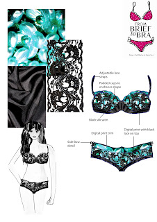
 Illustration board for the bra and brief collection.


